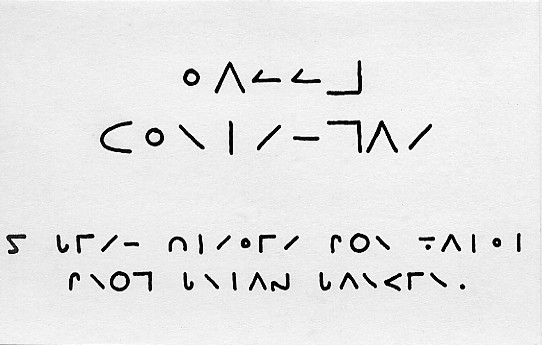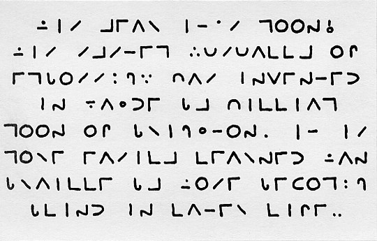
Users of dangerous household fluids will be familiar not only with the raised dots of the Braille warnings on their containers but also of other embossings in a cruder, letter-like form. These are in Moon, an alternative code for blind people and those with impaired vision, which is apparently easier for older people with perhaps less-sensitive fingers to learn and read. Both pages of this year’s card were in Moon, derived from a card describing the code published by the Royal National Institute for the Blind.
Front page

This translates as:
The “and” here is a single Moon character and the figures “1989” are represented by the “number sign” followed by the letters “AIHI”.
Inside page

This translates as:
There are further economies here: “th” is represented by a single character, roughly a combination of those for “t” and “h”, and “ing” is two characters, a “contraction” character followed by “g”. I cannot now remember why there are not one but two final dots – perhaps to indicate the end of a paragraph or the entire message.
Version 24: Revised 23 December 2008
Brian Barker